Optional Y Series Grouping
Optional Y Series Grouping: This video contains how to use optional y series grouping in OPNBI.
This document contains information of how to use optional Y series Grouping in X-Y charts. List of chart in which this setting is used is Column, Bar, Line and Area chart.
Use Case: This feature is useful when we want to visualize chart data by some group values for example year, month or something else.
Please follow these steps to learn how to use Optional Y series grouping;
- Log in to OPNBI using valid credentials
- Create a new dashboard and add a column chart widget
- Provide below values in chart;
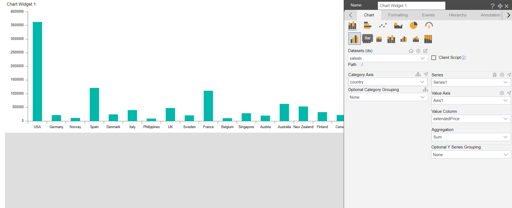
- Resize chart widget for batter visualization. Now this chart shows the analysis of Price by country. In order to view this entire visualization year wise, edit this chart widget and select Optional Y Series Grouping : year. You will see whole visualization is changes as shown in below image;
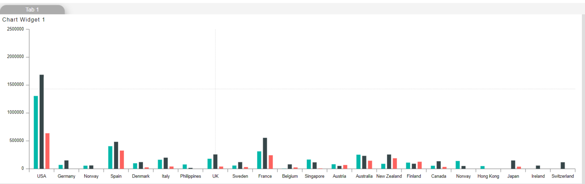
- You can see whole chart is grouped by year now, you can see 3 column for each country that means dataset has 3 year value.
- To view which bar represent which year, edit this chart , go to formatting tab, go to legend option and enable legend from legend property list as shown in below image,
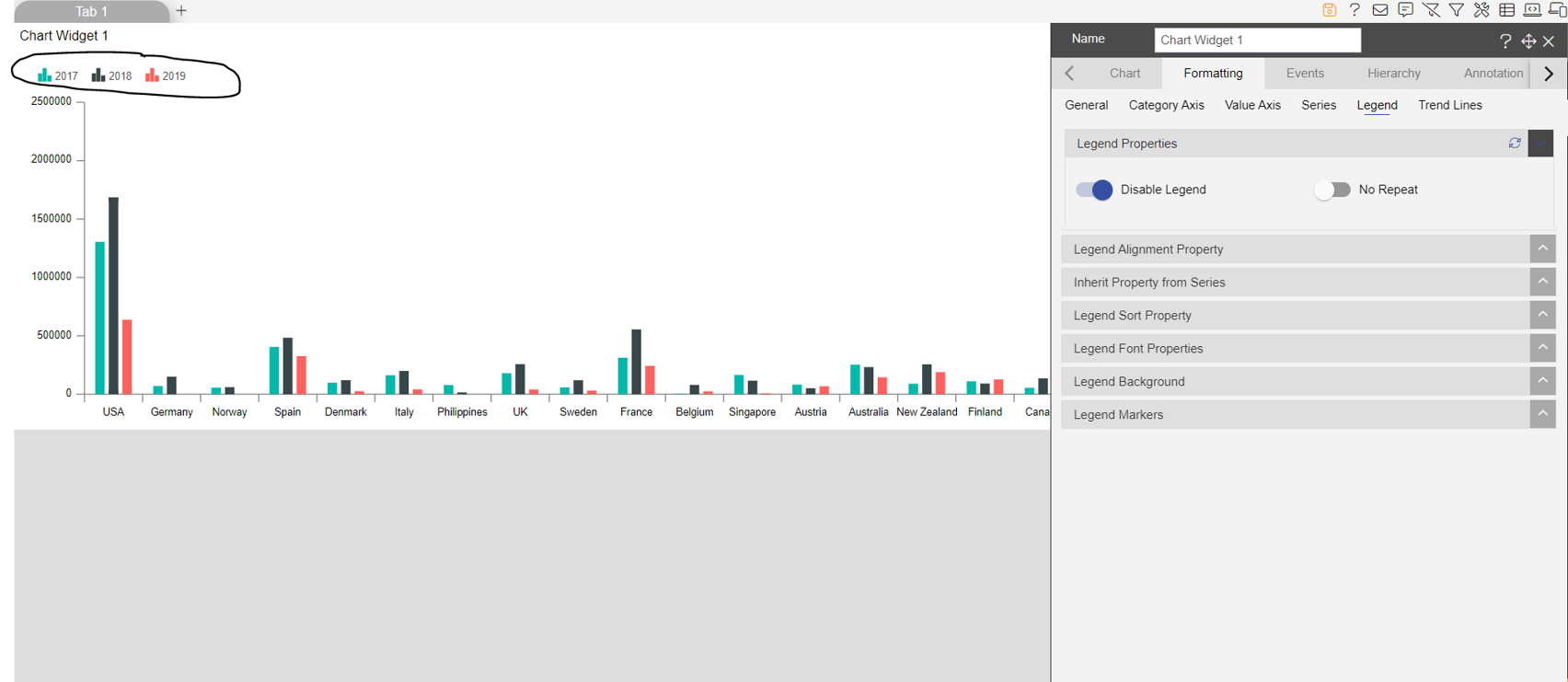
- As soon as you enable legend in chart, you can see legend is added on the top left side of the chart widget. Now you can identify the year column with colors of legend added.